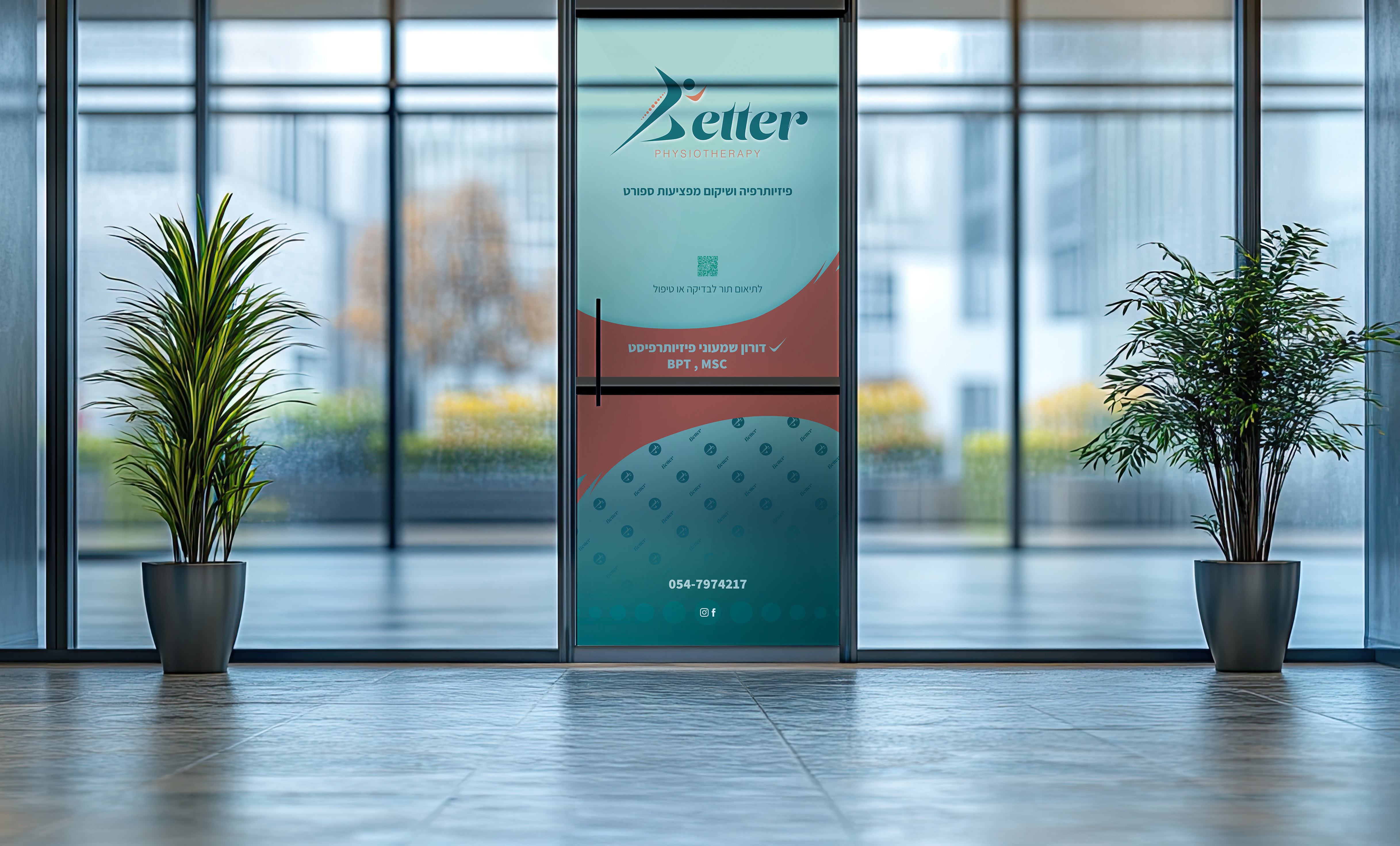
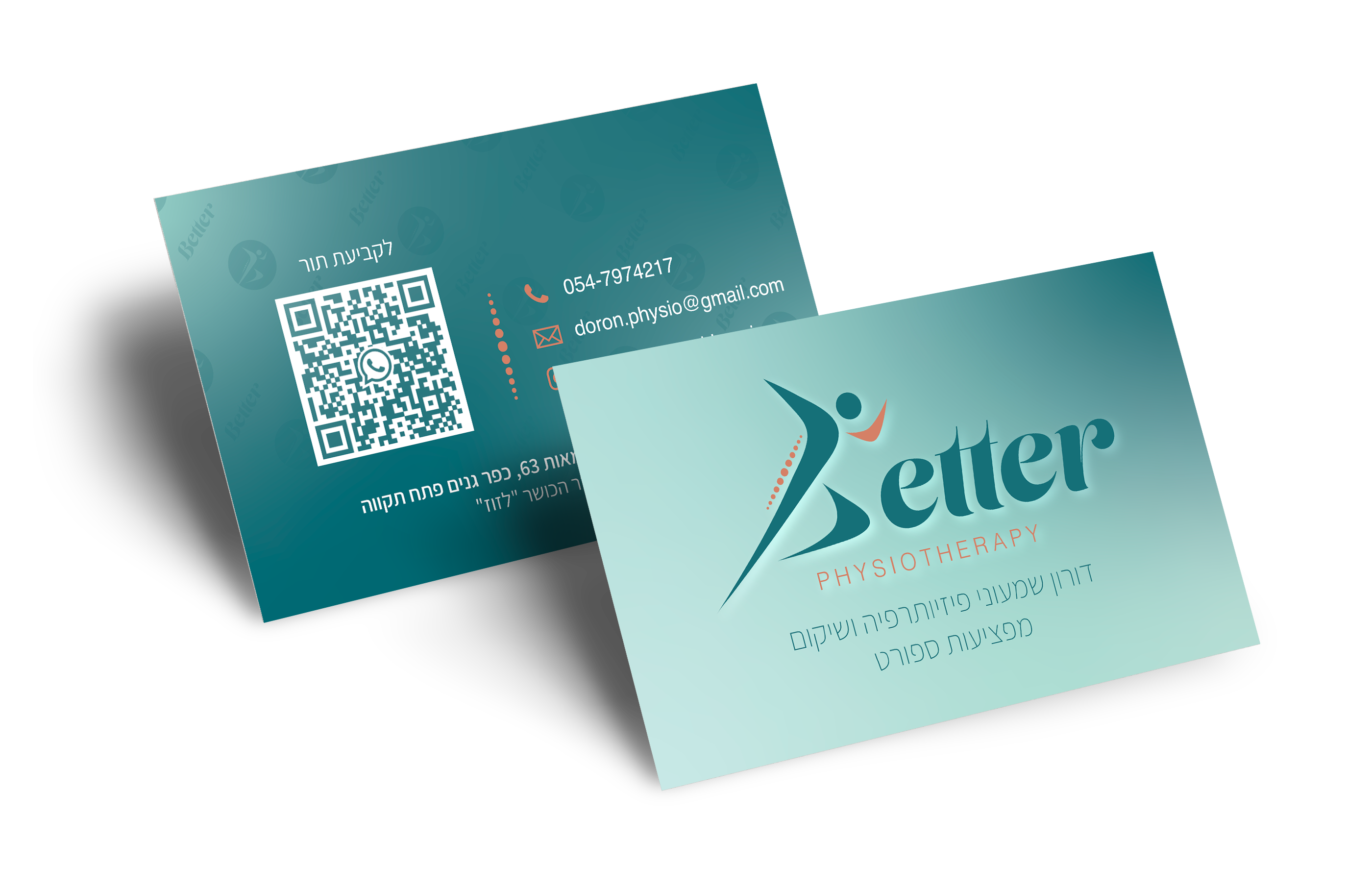
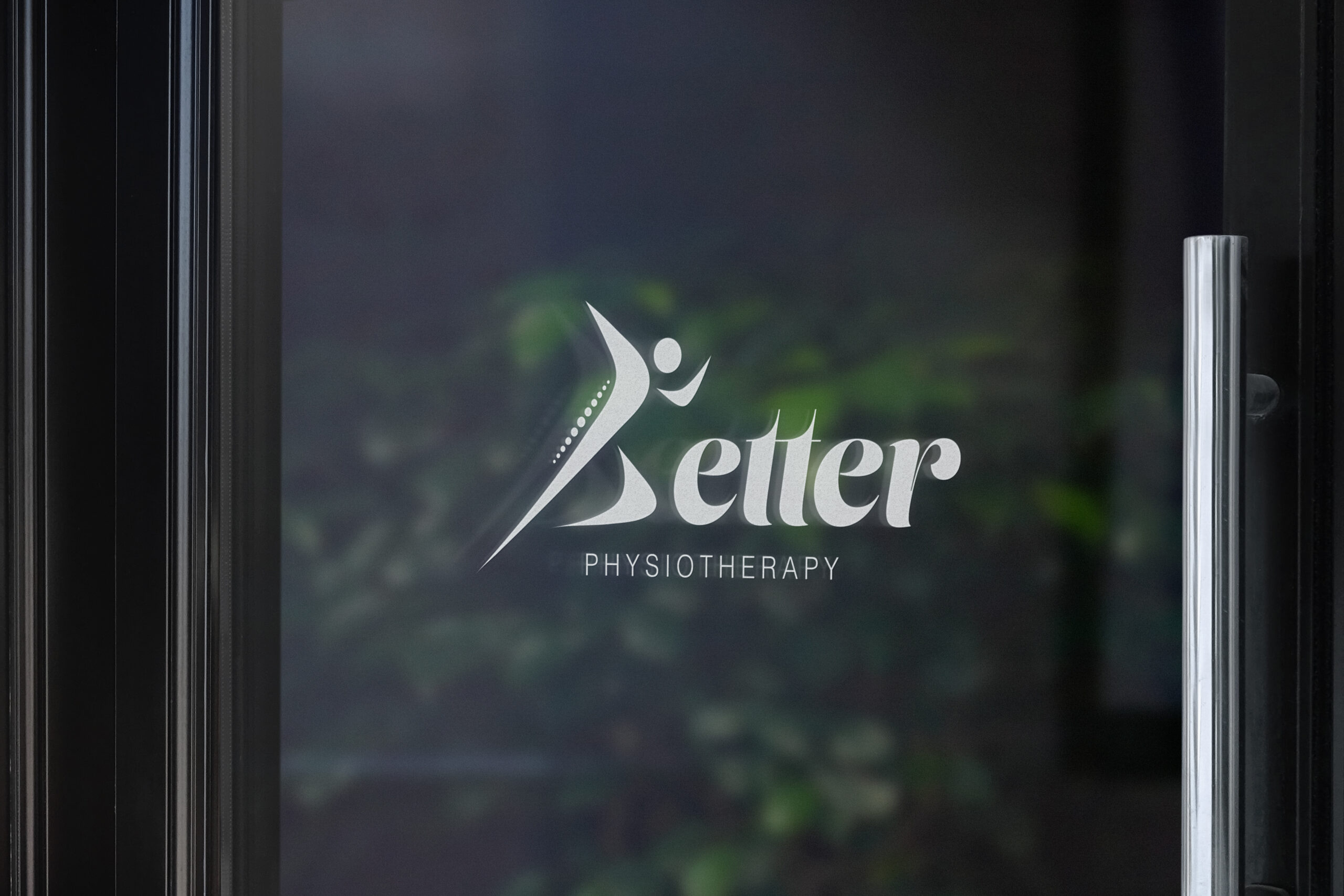
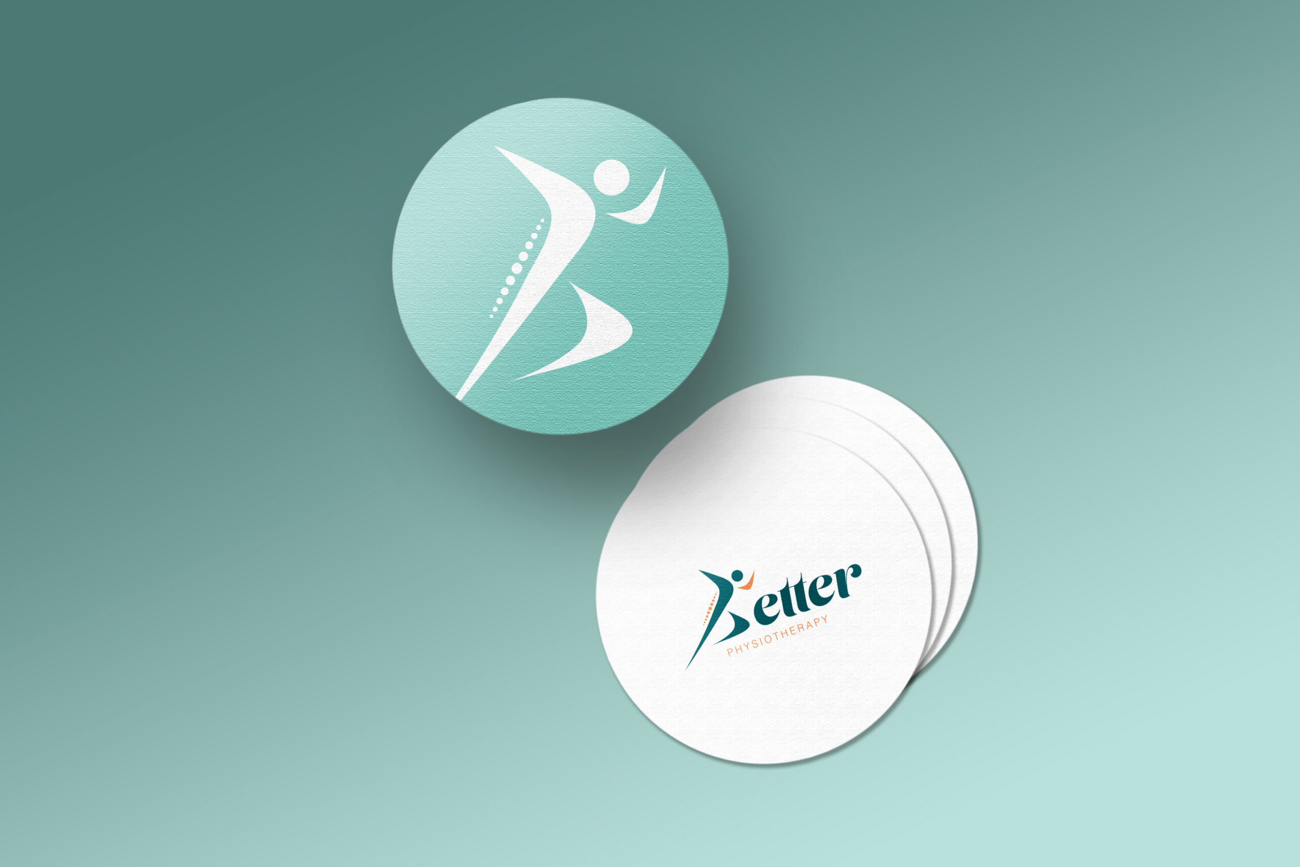
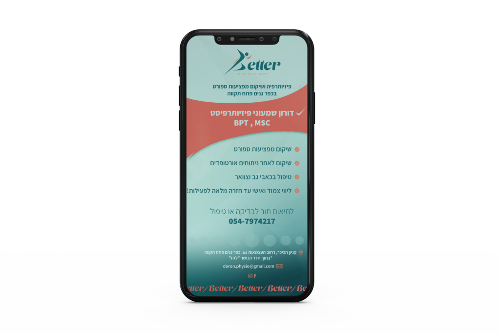
קליניקה לפיזיותרפיה המתמחה בפציעות ספורטאים.הקליניקה ממוקמת בתוך חדר כושר ופונה לקהל יעד ספציפי.לאחר מחקר שוק, קהל יעד ומתחרים הגענו לתוצאה מדוייקת עבור הלקוח עם לוגו ייחודי, זכיר ומעניין הנוצר מתוך שם המותג.צבעוניות מדויקת של טורקיז המתייחסת לחידוש רמות האנרגיה בגוף, מחשבות חיוביות ושלווה, בשילוב הצבע הכתום המסמל בריאות, חיוניות ותקשורת.הצבעים נותנים מענה פסיכולוגי עבור עסק שמתמחה בבריאות הגוף.הוספנו פאטרנים, אייקונים ואלמנטים להשלמת זהות אחידה, וכל אלו הביאו אותנו לכדי מיתוג משגע!