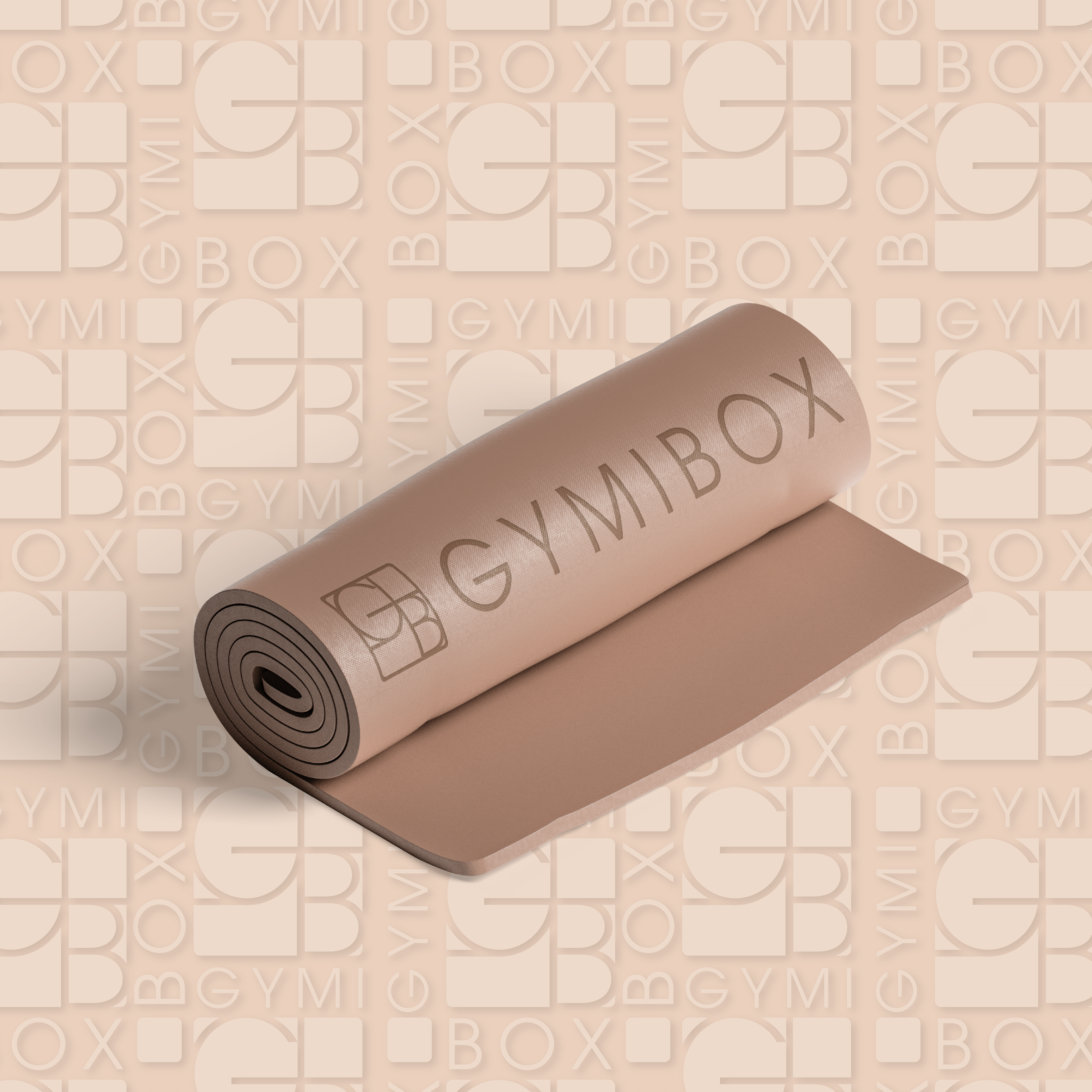
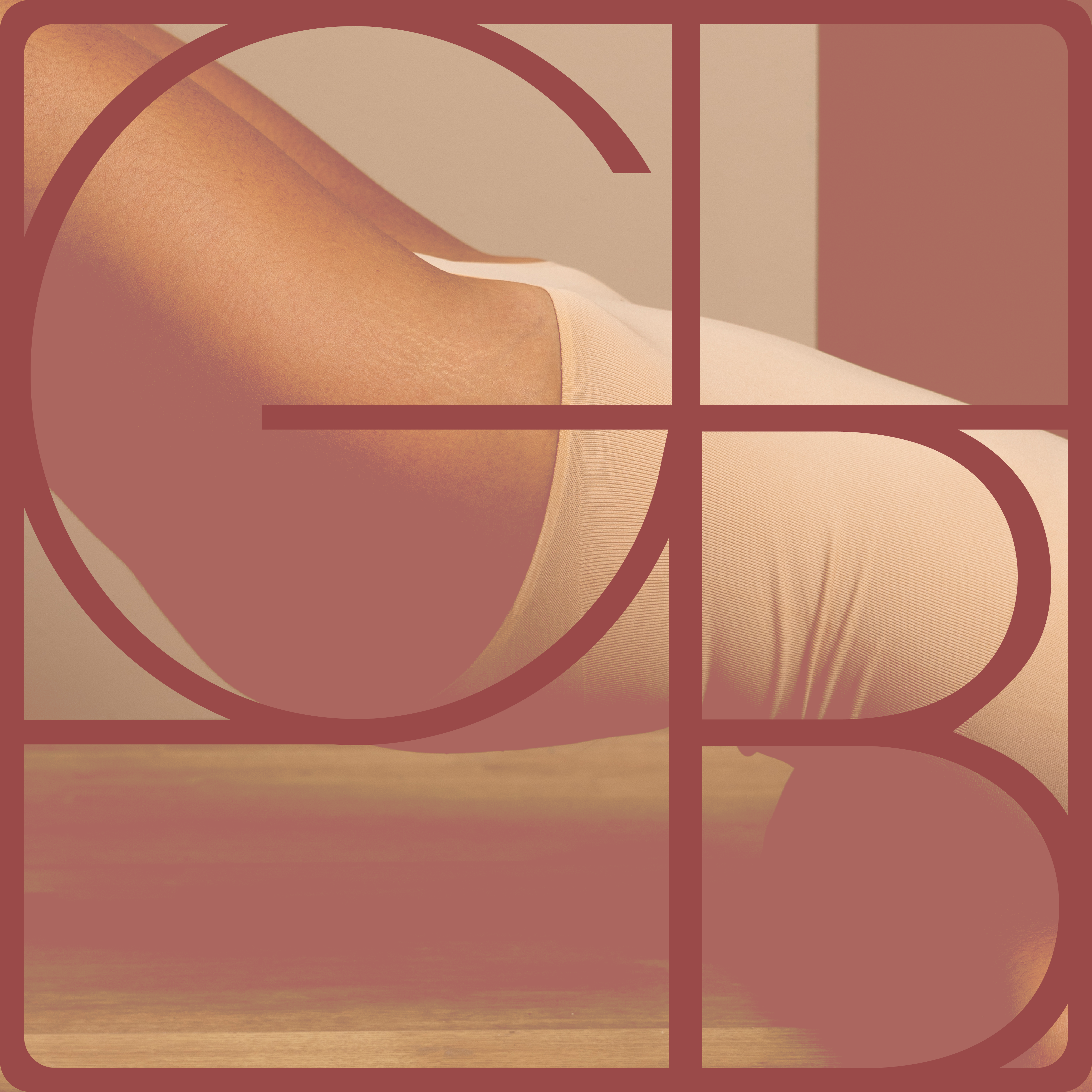
GYMIBOX is a multi-location Pilates and fitness studio chain seeking a refreshed and unified brand identity.
Challenge
The challenge was to refresh an existing and recognizable brand without losing its loyal audience and emotional connection. It was important to preserve the energy and familiarity that existing clients were used to, while introducing a more modern, forward-looking identity that reflects the brand’s growth and evolution.
Strategy
We approached the rebrand with a balance between continuity and innovation. The goal was to maintain brand recognition while gradually shifting its visual direction. The existing red color became a core anchor, but was refined into softer, more contemporary tones to better align with the predominantly female audience and the evolving brand positioning.
Execution
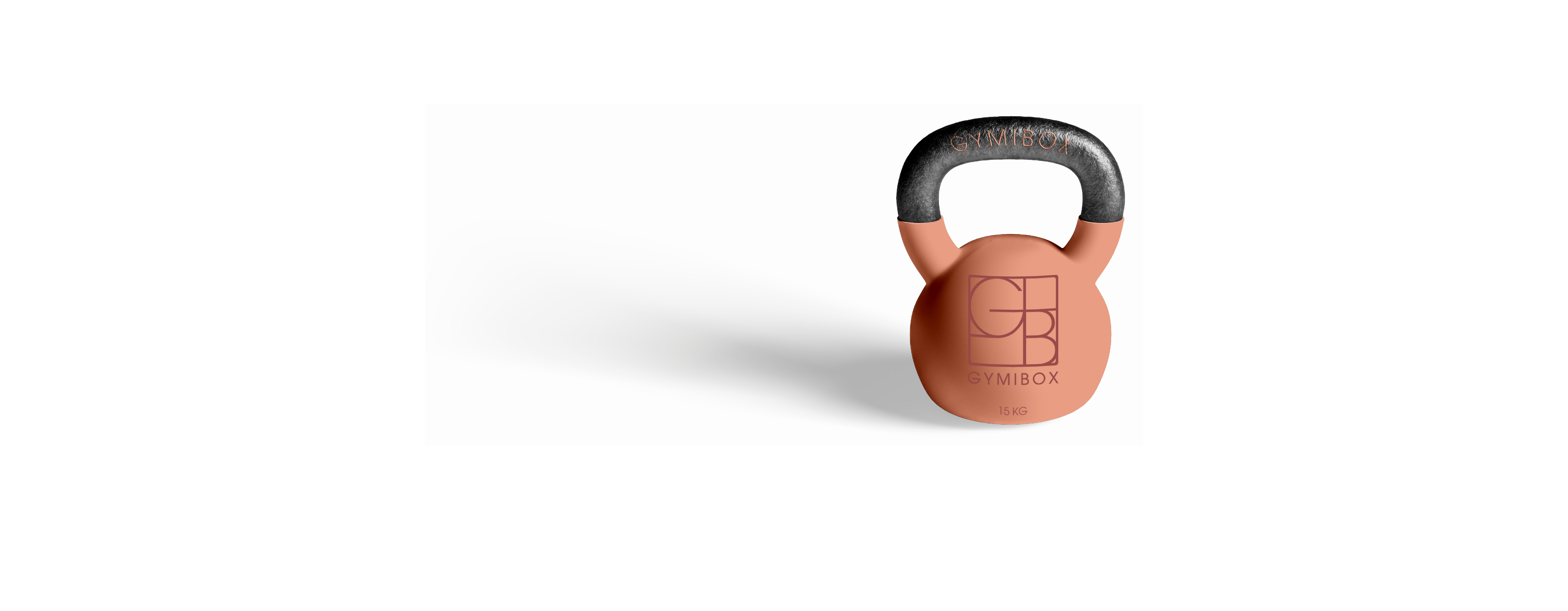
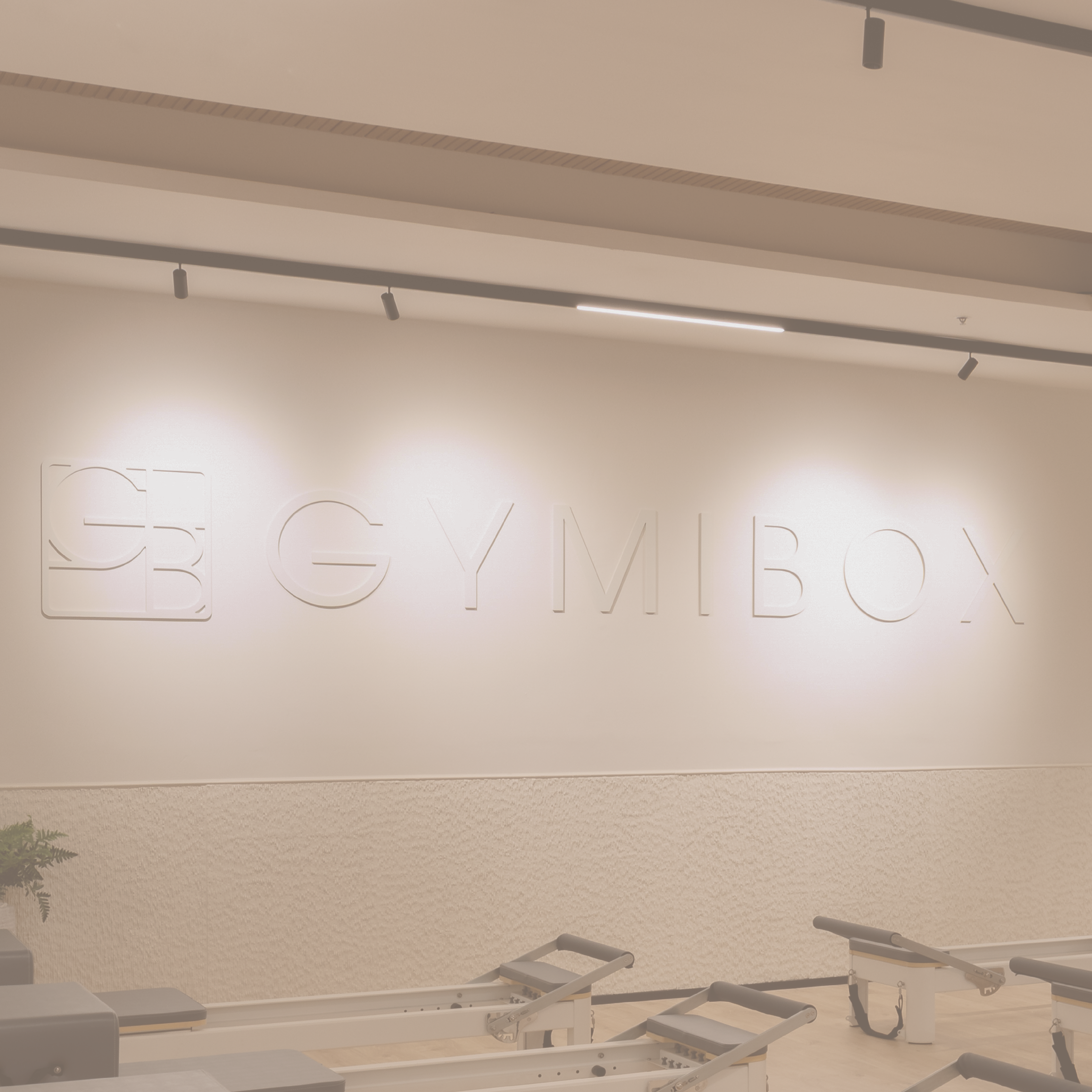
We redesigned the logo and developed a unified visual system, including typography, refined color palette variations, and scalable design applications across multiple studio locations and touchpoints.
Outcome
A refreshed and cohesive brand identity that preserves recognition and loyalty while introducing a more modern, elevated, and scalable visual language for a growing fitness chain.