A physiotherapy clinic specializing in sports injuries.
Located inside a gym, the clinic targets a specific audience.
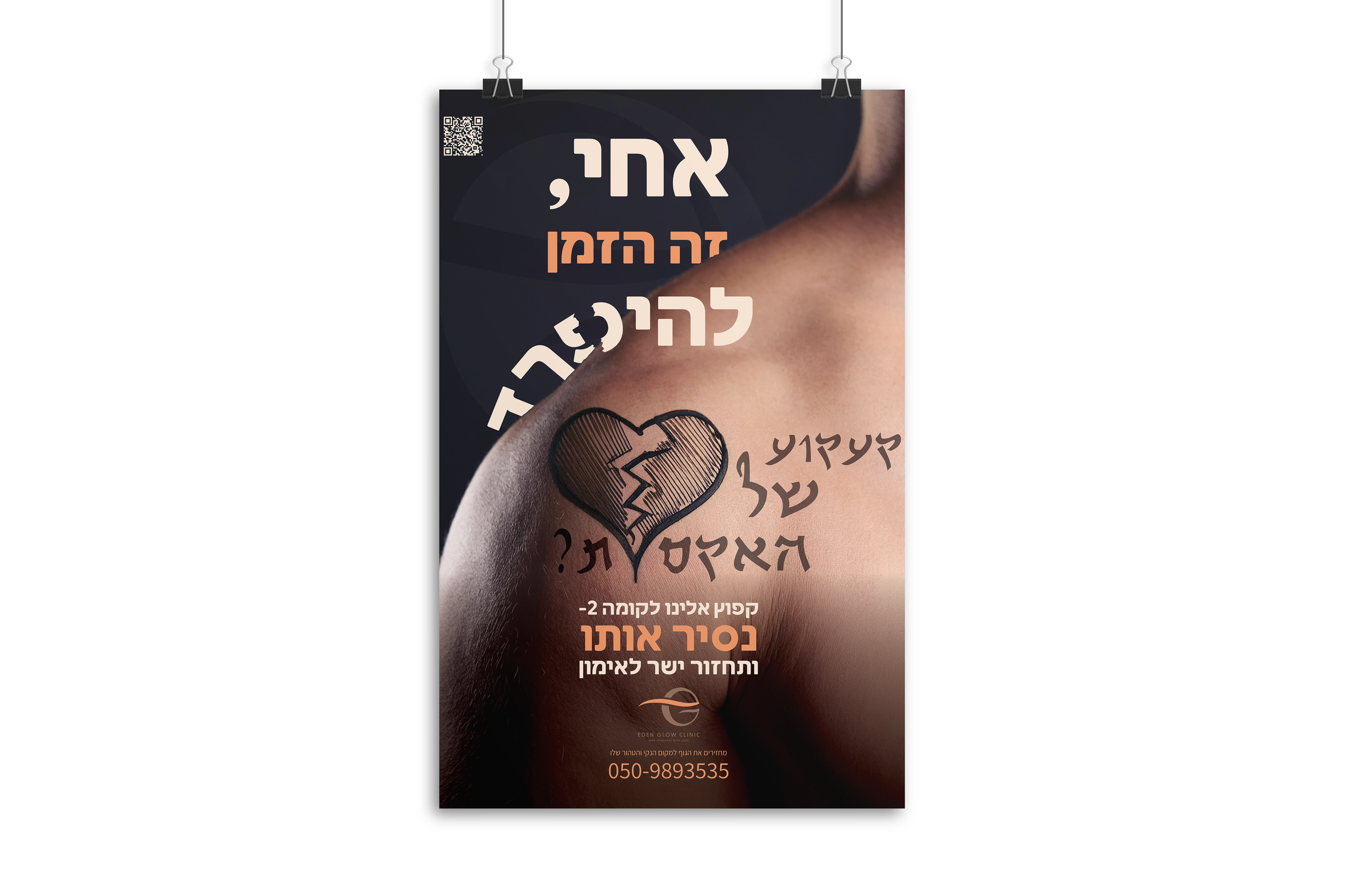
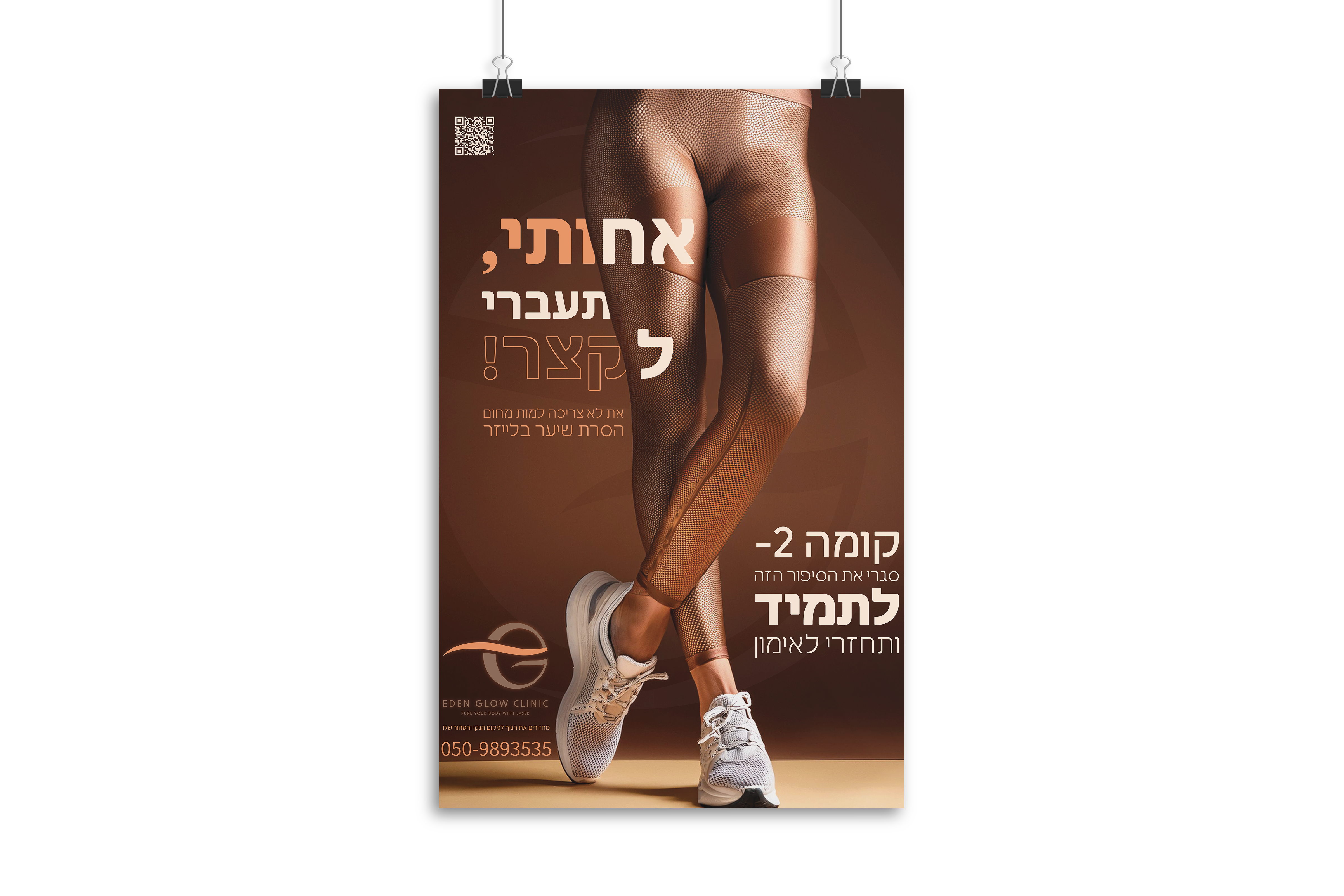
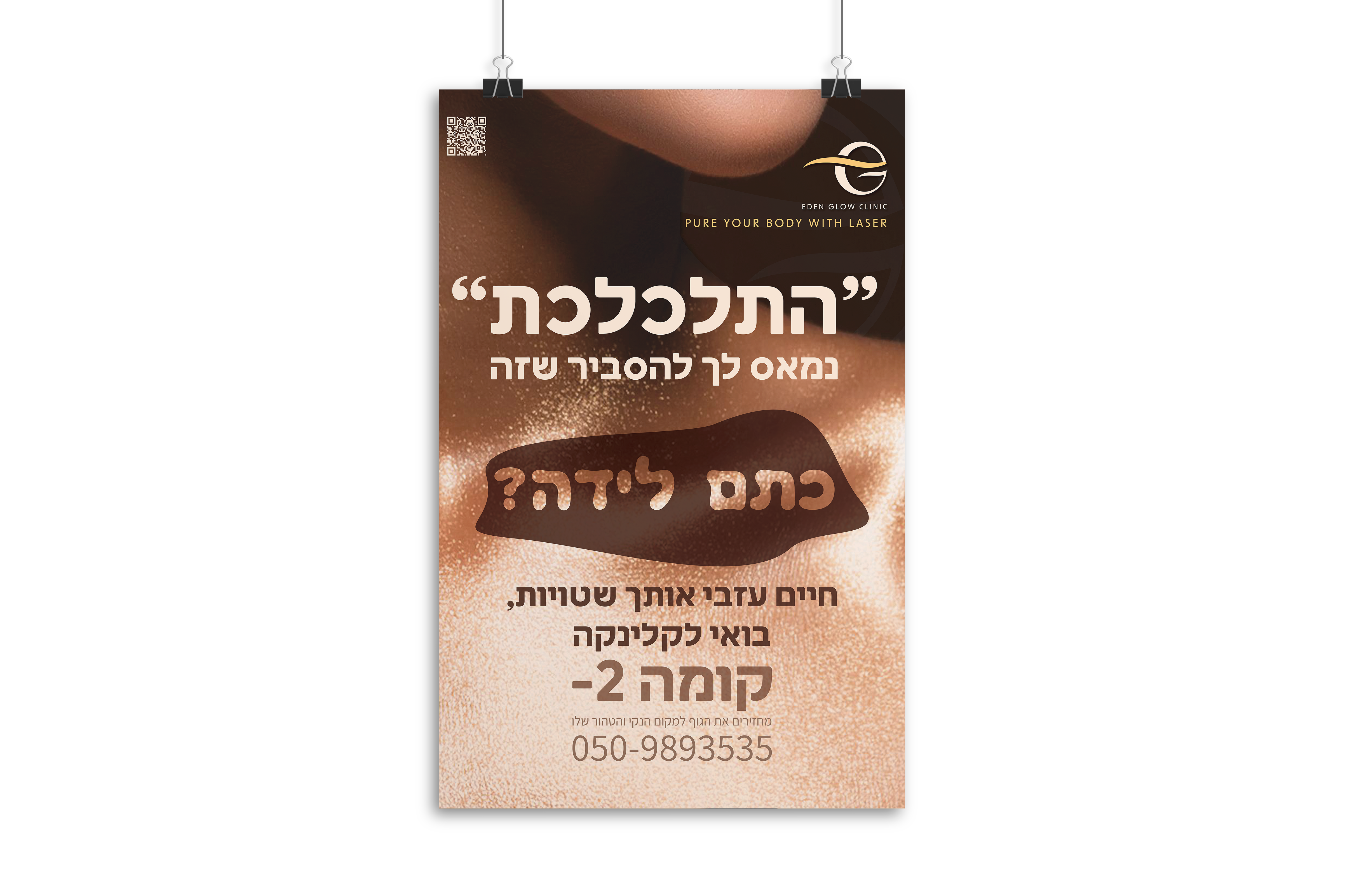
Following in-depth market, audience, and competitor research, we crafted a spot-on brand identity.
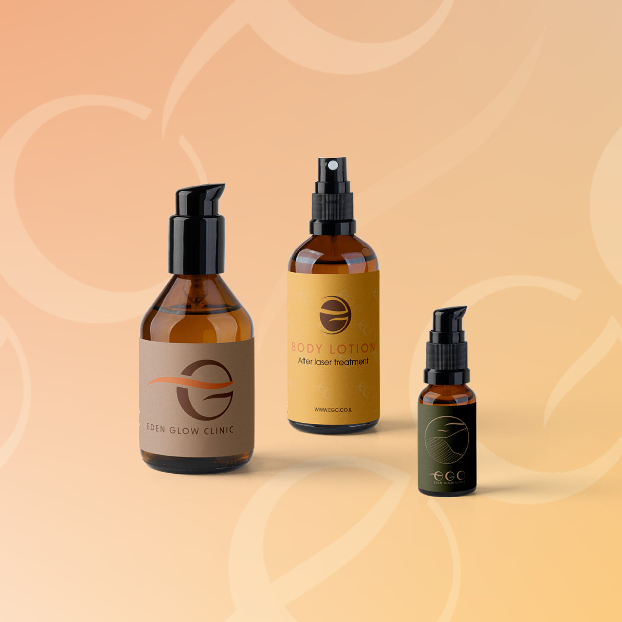
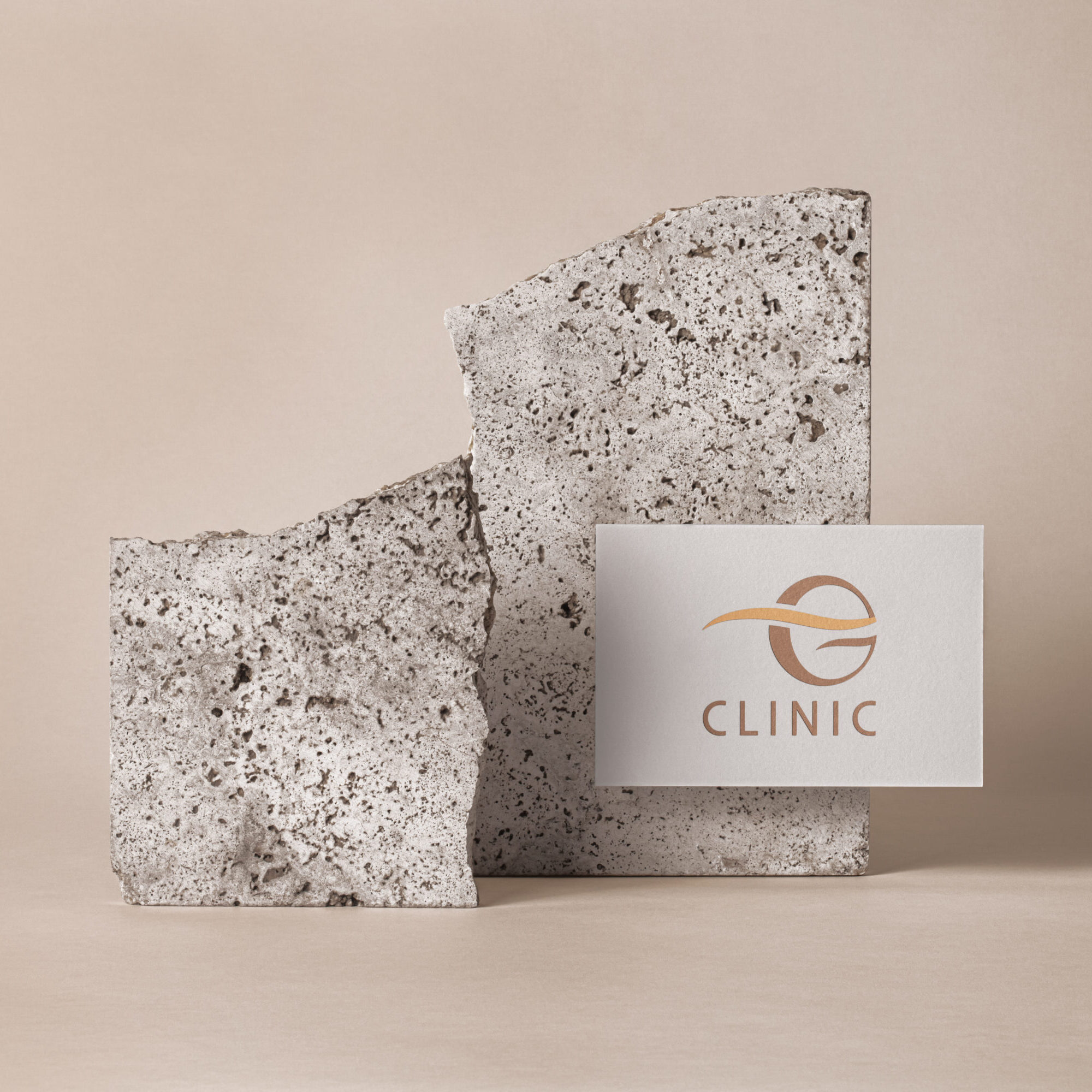
A unique, memorable, and meaningful logo was created from the brand name.
The color palette: turquoise to symbolize energy renewal, positive thinking, and calmness, combined with orange representing health, vitality, and communication.
These colors work together to support the psychological needs of a health-focused business.
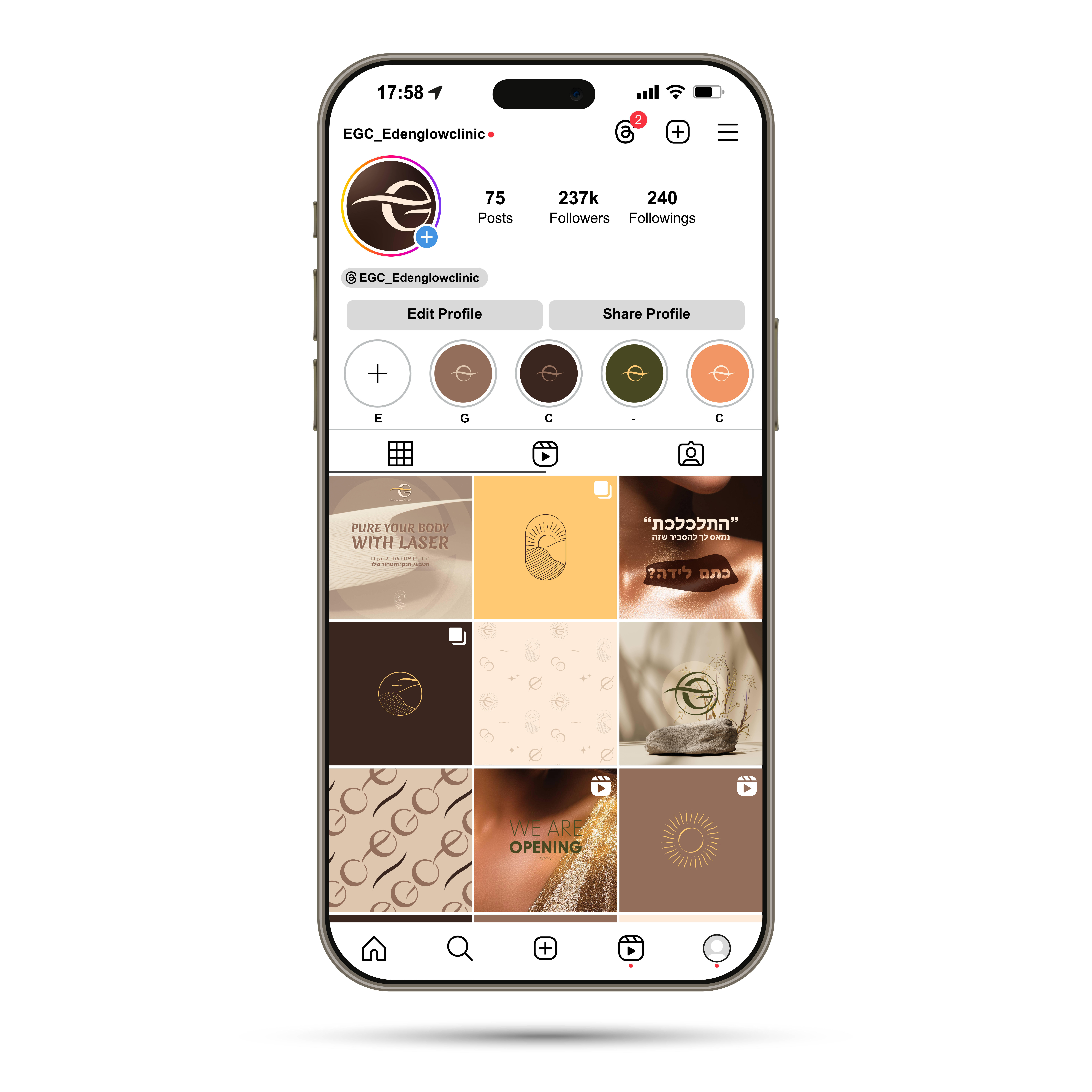
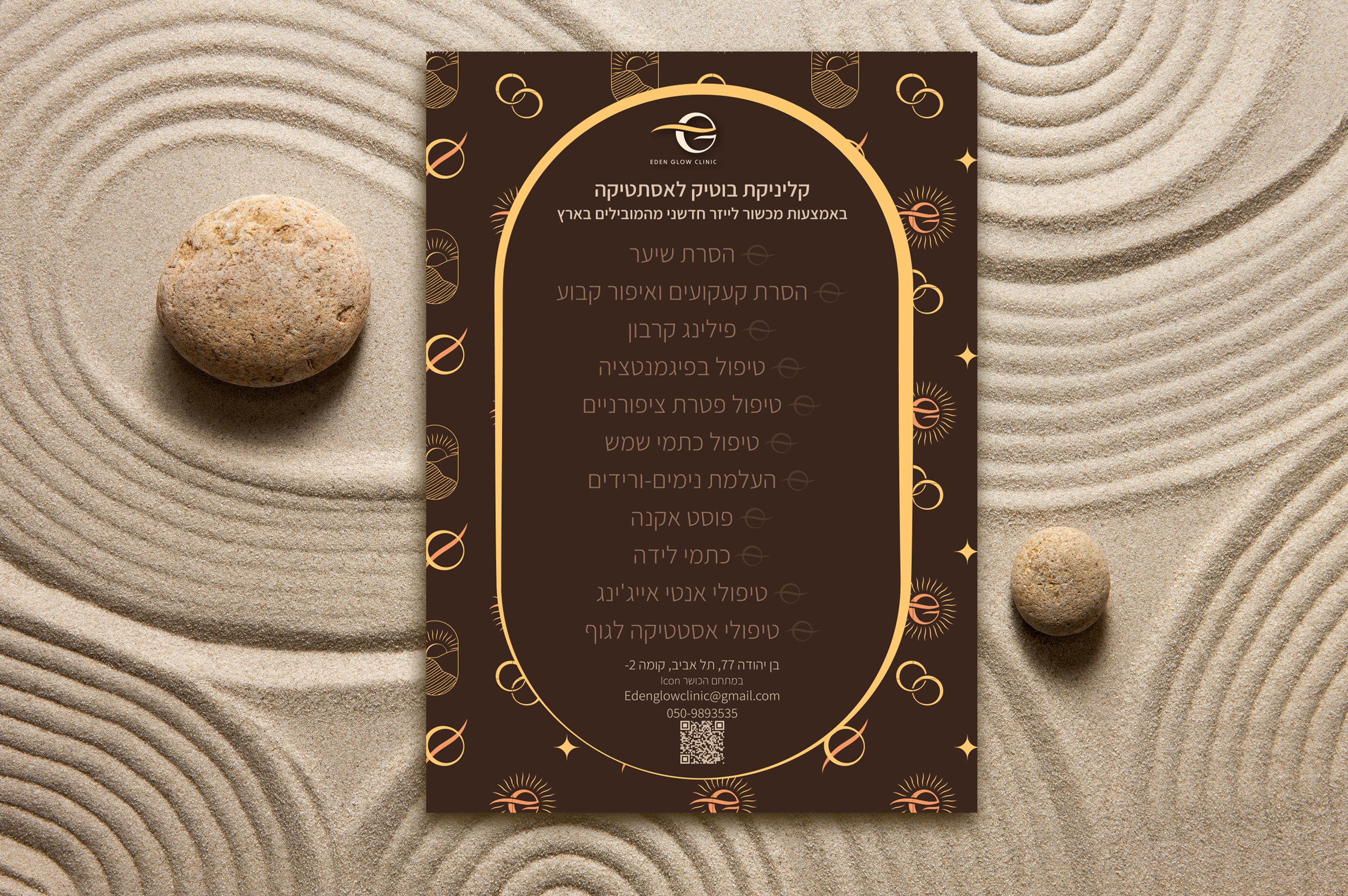
We added patterns, icons, and graphic elements to complete a unified identity — resulting in a stunning brand!
